Book Cover Redesign
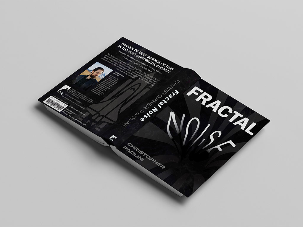
For this project, I redesigned a book I had already read—Fractal Noise by Christopher Paolini. I originally loved its cover, so reimagining something I admired was a real challenge. I wanted to keep the bold red reference to the black hole while giving it my own twist.
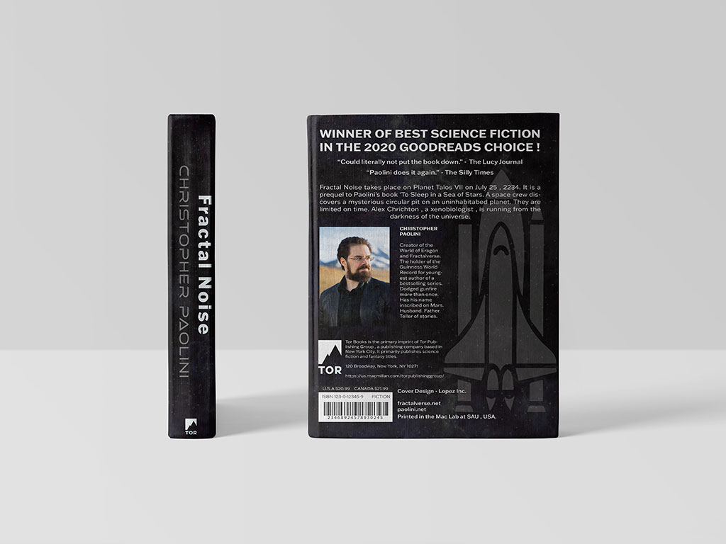
I focused on typography, especially making the title feel like it was being pulled into a black hole. The back cover became my strongest area after a lot of trial and error with the layout.
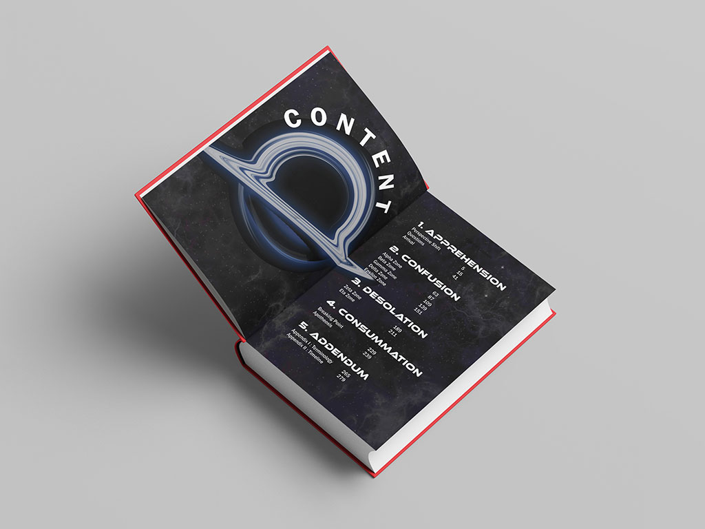
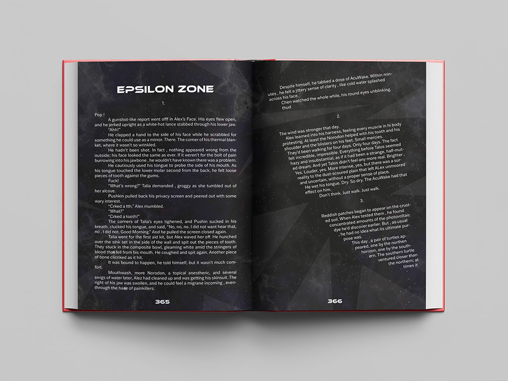
The biggest struggle was warping the title. I moved between Photoshop and Illustrator, watched tutorials, and even used Play-Doh to understand the distortion. It took most of the project to get it right. The back cover and chapter spread turned out solid, but the front cover was consistently the weakest during critiques.
Overall, the design came together with a dark, bold tone I’m proud of, but I’d still like to revisit the front cover to make it stronger.


