Paragraph Control
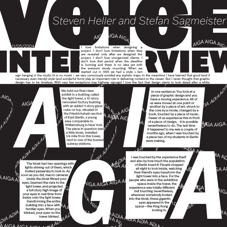
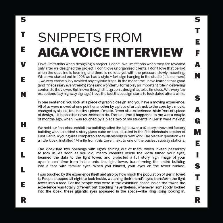
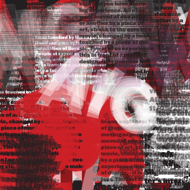
For this assignment , we had to create three 7” by 7” typographic layouts from an article that was given to us. We could not change the content and we had to include all of it , but everything else was left to our imagination. Each layout was labeled controversial , adventurous , and outrageous. The content was bits of an interview from AIGA , featuring Stefan Sagmeister and Steven Heller.
I love big and bold. It is such a good look if you are able to create something like that but not make it look like it's too much. I did struggle with the controversial one. It was considered a simple one and I could not figure out how I wanted the layout to look like. Our first draft , my controversial, was definitely my weakest one , but the other two were pretty strong , they just needed more TLC. I spent a few days playing around with it and went in a whole new direction that I was not confident in , but after presenting it , everyone seemed to like it. I played with the scale of my layouts and added a bit of color to my outrageous one.
We had to vote whose paragraph control was the strongest , and the whole class gave mine a vote. One by one. Seeing that others valued my work after I spent countless hours on it made me extremely proud of myself. It is something that will help me reflect on future projects because I know there are more directions that I could have headed with it.